

The Star Trek franchise is currently experiencing a surge in popularity thanks to the successful ST: Discovery show on Netflix and the constant reports of various potential spin offs. So this is a prime opportunity for IDW Publishing to push it’s Start Trek comics, and what better way than with a universal cross over event.
Featuring the crews of two Enterprise’s, Voyager and the Defiant along with some of the most powerful beings in the franchise’s history, Star Trek The Q Conflict is an epic undertaking.
Writing/Story
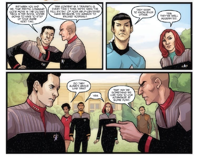
Continuing the interstellar game set by Q and the other god-like beings, the federation crews are pushed to their limits. After an initial loss in the first game, Q argues with Captain Picard over the importance of the situation.
Meanwhile the other captains take some time to dig for information about what is really going on.
All too soon the second game begins and someone bends the rules to add an element of danger to the proceedings.
With such a large cast writers Scott and David Tipton have to pick and choose the characters carefully for each scene. They have an advantage in that most readers will know the characters quite well: very few none Start Trek fans will be reading this comic. But this also leads to very little character building within the narrative. The characters are there to play a given part and nothing more, like the survivors in a 1970’s disaster movie who each have a single skill to help plot move forward but nothing more.
There is some great dialogue between a number of the characters, especially Picard and Q who the Tipton’s have got spot on. Unfortunately, a lot of the speech is exposition with no real character voice. Large sections of the dialogue could be spoken by any of the cast. With all of this exposition you would expect that the narrative to move on at a fast pace however, apart from the constant references to the war Q is raging, there is nothing new added to the overriding story.
Just like last issue, the game that the crews are forced to play is barely entertaining and over before it’s had a chance to get interesting. The whole escapade feels like an opportunity missed.

Art
This comic’s saving grace is the artwork. The strong inking by Ellsabetta D’Amico defines the characters wonderfully giving them a presence on the page. There is a clearly defined foreground focusing the reader’s attention on the crew and the ships. The backgrounds are mere color washes that serve no purpose giving the entire story an air of unreality. This works well for The Q Conflict because much of the story is set in environments created by the God like beings.
Alessandra Alexakis’ color work successfully differentiates the foreground from the background. The cast have a uniformity to them but he still manages to separate each of the different crews, allowing the reader to instantly recognise who is who. Part of this is down to the pencil work and lay out design by David Messina who creates striking likenesses of the characters, even from a distance.
Unlike the rather mundane plot, the art has some expressive features and the cast display some emotional reactions to the world around them. There is an element of dynamism in the space battle but not enough plot for the art work to really shine.
Due to the amount of dialogue Neil Uyetake has a difficult time positioning the lettering in exciting or effective ways; there are moment’s where it feels that he has had to fill a space just to get the speech in. He does, however, employ a number of clever balloon framing techniques to emphasis the loudness of the speech. He presents whispers in the background and shouts in the foreground in subtly different ways that the reader subconsciously picks up.

Conclusion
Star Trek The Q Conflict has a wonderful premise at the heart of it but because of the cast, or writers, insistence on no fighting there is a distinct lack of conflict. At most there is some heated bickering but this is not enough to make the comic a compelling read. Most of this issue is a half time locker room pep talk. And when the action does start it is over too quickly, losing any sense of threat that the situation may have held.
Overall this comic has more in common with the original 1960’s episodes of Star Trek than it does any of the newer incarnations. The other federation cast member’s seem out of place and lost in a narrative not suited to their characterisations.
The best way to sum The Q Conflict up is to quote Trelane from this very issue:
“Nothing is happening! This isn’t combat or strategy! There’s no stakes! I’m not feeling the excitement!”