

Star Trek: The Q Conflict brings together characters from various iterations of the Star Trek Universe and pits them against their most powerful foe. It is an ambitious undertaking but with Scott and David Tipton at the helm, IDW Publishing are sure to have a hit on their hands.
Star Trek has a long history of crossover events with characters from different aspects of the series meeting up. They did it during the The Next Generation TV run and then on each subsequent series. There are a number of novels and comics already out there that adopt this narrative. The key is to be able to juggle all of those massive egos (i.e. The Captains of the Star Ships) while maintaining an exciting story without descending into a crossover for a crossover sake. Something that the movie Star Trek Generations was guilty of.
The Tipton’s have been writing Star Trek for IDW for many years now and this isn’t their first crossover story-line. In fact, they have written crossover events featuring the Star Trek characters meeting people from Doctor Who and Planet of the Apes. But The Q Conflict is an ambitious attempt to bring characters from four series (at least) together. Can they pull it off or have they attempted too much Trek at once?

The Writing/Story
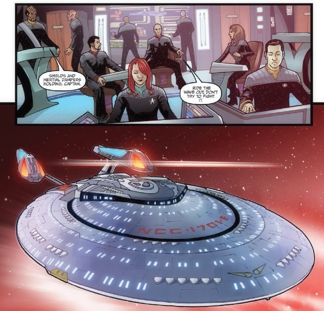
As The Enterprise (NCC-1701-E), under the command of Captain Picard, speeds through space on a rescue mission, the crew witness first hand an unexpected Supernova. This is just one of a number of such unnatural occurrences within the Beta quadrant and not even Data can come up with a possible explanation.
The Tipton’s open up their new Star Trek adventure in a usual and comforting fashion. The Enterprise is mid adventure and the reader is thrown in the deep end. The mission is slowly revealed at first via the standard briefing room scene then by a related distraction; the nearby Supernova. As the crew arrive at Cestus to assist in the evacuation of a planet there is another unexpected occurrence followed by the arrival of an old friend: Q.
The pacing of the adventure is perfect Star Trek as a minor revel happens in the middle of the issue followed by a bigger reveal, and the essence of this series, right at the end to create a gripping cliff-hanger. There’s no surprise that the always enjoyable Q is going to turn up because of the title of the story but that doesn’t mean that there can’t be some mysteries to uncover or surprises to be had. The Tipton’s handle this element of the comic very well, keeping the narrative intriguing and moving along at a steady pace.
The characters are written really well with dialogue that fits their personalities. Q has the arrogance that is associated with the character and the banter between him and Picard plays out wonderfully. The reader gets the sense that these two characters have a long and complicated history even without having to know anything about them. This comes from the Tipton’s familiarity with the characters. It is obvious that they have spent years writing these characters and their knowledge and understanding is evident on the page.

The Art
The panel layouts in The Q Conflict give the scenes a dynamism necessary for what is in essence a very static story, especially in the opening sequences. The ridged Starship setting is brought to life by the sense of depth provided by David Messina’s pencils and Elisabetta D’Amico’s inks. Solid thick lines define the characters giving them a strong presence on the page even against the highly detailed backgrounds.
The one artistic choice that does become noticeable as you read is the decision not to have a single character open their mouth. This may not seem like a problem but it soon becomes apparent, especially as there is a lot of conversation in this issue. It makes for an eerie atmosphere. The result is that the figures end up having an element of mannequin about them which is unintentionally unsettling.
Aside from this one aspect, the figure work is impressive, helped by the color work by Alexandra Alexakis. Alexakis’ work really begins to excel when the different Star Trek Series characters begin to interact with each other. The attention to detail in the uniforms, for example, is exemplary.
The lettering by Neil Uyetake also comes into its own when certain characters interact. Each of the Omnipotent Beings has their own typeface making each character individual and, most importantly, differentiating them from the Humans. This lettering decision creates the necessary distance between the All powerful characters and the Federation regulars.
As with the Tipton’s attention to detail in the narrative, the art work expresses the creators love for the series and their commitment to this story.
Conclusion
In 1994 Peter David wrote Q-Squared, a non-cannon story that attempted to link Q from The Next Generation to the Squire of Gothos from the Original Series and a whole bunch of stories in between. The Q Conflict appears to be broaching on similar themes but with a wider net. By bringing together so many aspects from the full history of Star Trek you would think that it’s appeal would narrow. This is not the case with The Q Conflict for two reasons.
Firstly, Star Trek fans, especially those who indulge in the expansive universe, already know a great deal about each series. This allows the Tipton’s to use that knowledge in the narrative to build expectation and even throw an occasional curveball just for those in the know.
Secondly, all of the creators working on The Q Conflict understand that this might be someone’s first venture into the Star Trek world and the entire comic is designed around that concept. Some of the nuances of narrative may be lost by not knowing who everyone is, but the story uses natural dialogue to explain what is going on as it progresses.
The two aspects may seem to be contradictory but that is where the clever scripting really shines because, not only are the Tipton’s balancing a wide range of characters, they are aiming the comic at a large audience. And the first issue of The Q Conflict is a success in this regard.
The only complaint to be levelled at this first issue is the lack of emotion in the characters faces. The expressions and reactions are wooden and the fact that no-one opens their mouths is surprisingly off putting after the first few pages.
Where the story will go and whether it can maintain the wide appeal that this first issue has is yet to be seen but The Q Conflict has set off in the right direction.